The 5th Square - Creating a Movement
Hardcoded into the identity of The 5th Square, an organization I co-founded tasked with building political consensus for better urbanism, is the belief that visual communication and attention to aesthetics can greatly enhance understanding, particularly of complex policy. This consistent visual language builds a standard vocabulary and improves cognition. Throughout the examples below, I was the lead designer. Most of these examples were also printed and helped build a growing community of support around our issues. In only a few short months after our founding, we had raised approximately $19,000 for the organization and the candidates that championed our policies.
VISION ZERØ Campaign
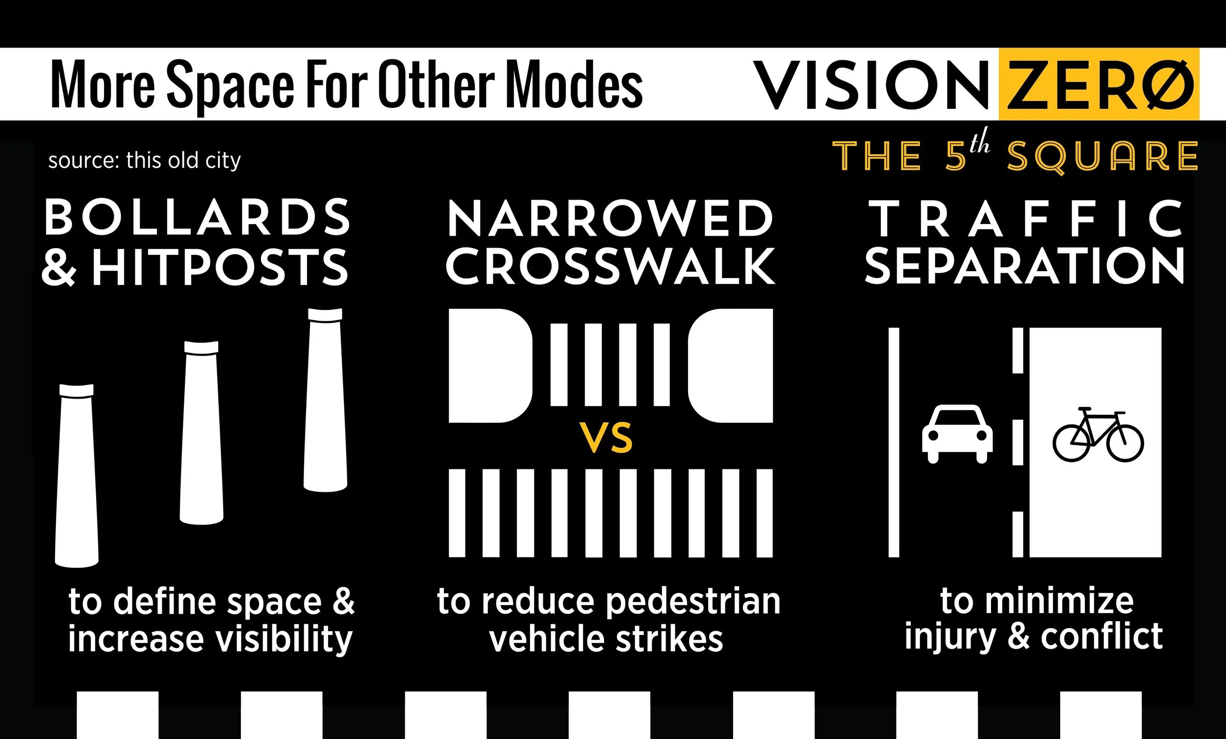
The three images above were created for our Vision Zero campaign to City Council. Although many peer cities in the US began addressing traffic deaths caused by vehicular crashes, Philadelphia was slow to take a stance and forward dialogue on the issue. I saw an opportunity to enhance the public's understanding of the issue and created the three policy explanations above. All underscore the role that urban design and public space interventions can have to safe lives and prevent serious injury. With Vision Zero the stakes couldn't be higher. After launching our campaign Philadelphia Councilwoman Cindy Bass (D - 8th District) championed our cause and introduced legislation and funding for Vision Zero across the city.
The 5th Square Platform Spoke Cards
As Co-founder and Chair of The 5th Square, one of my first tasks was to build a following for the organization by charging up support among our base constituency. Spoke Cards, so named because their size made them capable of being left in bike spokes, were used to tell the world who we are and what we stand for. Often the connection between local elections and good urban policy is not explicitly stated. As Philadelphia has experienced population growth due to net new migration into the city, we sought to tap into what this constituency wants: better public spaces, more responsive government, and safer traffic infrastructure.
The front of the card tells Philadelphians who we are and how improving the city will require consensus and political engagement.
The back of the card graphically and textually tells Philadelphians what we're seeking to do by outlining twelve policy positions, why they matter and what impact it will have on their lives.
For both sides of the Spoke Card, I built all logos and icons using a common visual language that's easy to understand, and frames important policy positions to forward our goals of a more livable and vibrant city.
Fonts, Branding, Swag
Building a consistent visual identity for a new organization meant seamless transition between web and print. Consistency builds credibility. As we grew as an organization, supporters told us that they took note of our attention to detail and that it set us apart from other political action committees in the region.
I led the configuration and formatting of The 5th Square's website, determination of the platform (NationBuilder) that helped us build lists of supporters quickly, and created materials like business cards that could be given to potential supporters to build our base. Below is a sampling of these designs, digital to print.
Election Endorsements
For our first round of endorsements as an organization, it was critical for us to expand on the work we started with the Spoke Cards above. This meant creating election leaflets that connected the general public back to our work. We included names, political offices and election machine buttons folks would need to push in order to vote for our candidates, all mirroring branding previously used across other printed material.
This leaflet was small enough to be given directly to folks on the street, could be tucked into doors as we canvased neighborhoods, and be taken into the booth to guide voters in citywide municipal elections in the fall of 2015.

